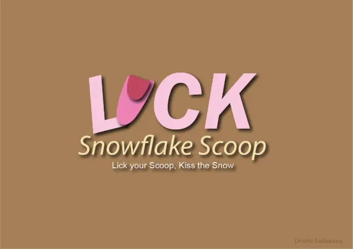
Lick Snowflake Scoop
Lick your Scoop, Kiss the Snow
Designing a playful, modern FMCG brand identity that connects people through the universal joy of ice cream.
Design Approach
Define brand persona
Prime focus is on youthful, approachable, warm

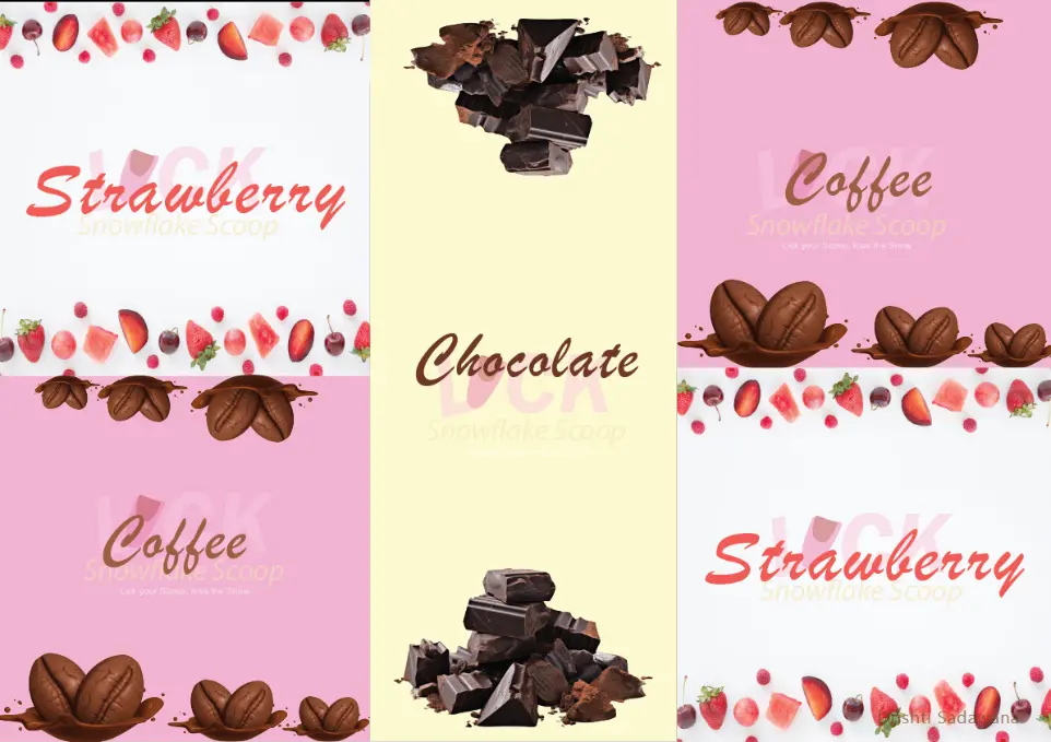
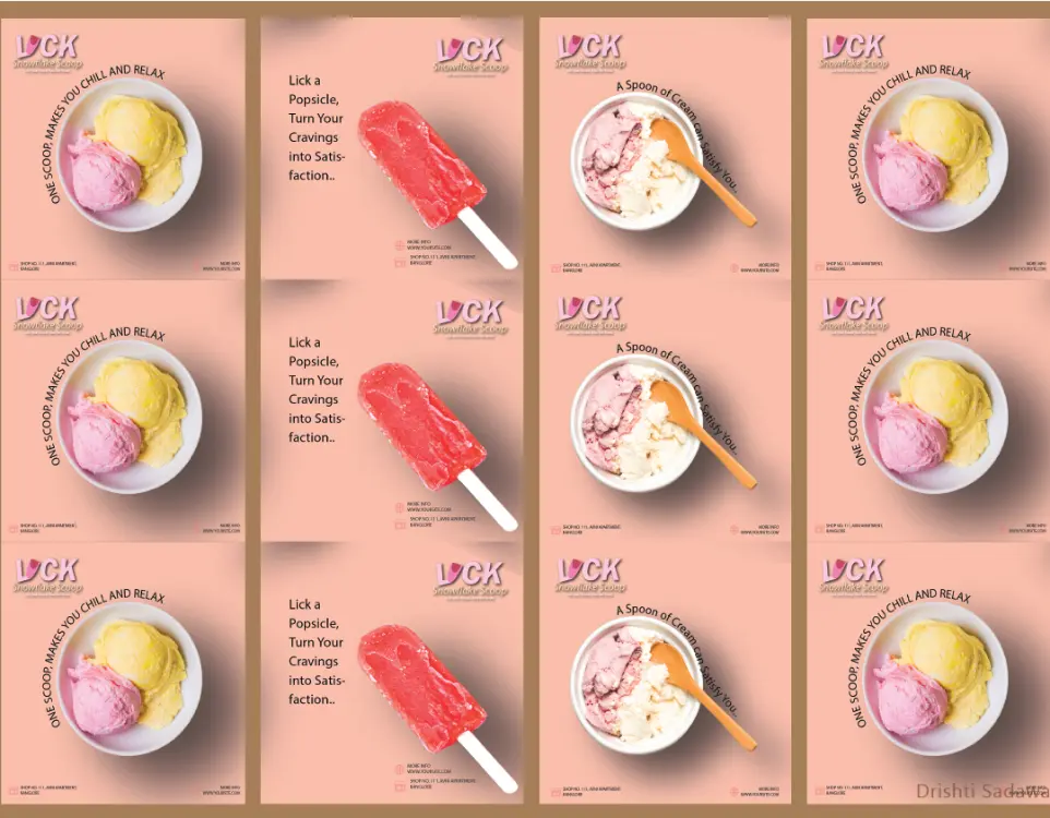
Social Media System
We designed a scalable social template system that keeps the brand consistent across campaigns.
Template styles: Flavor tiles, promos, playful copy.
Tone of voice: Cheeky, light-hearted, inviting.
Consistency: Layout rules for icons, footers, highlights.
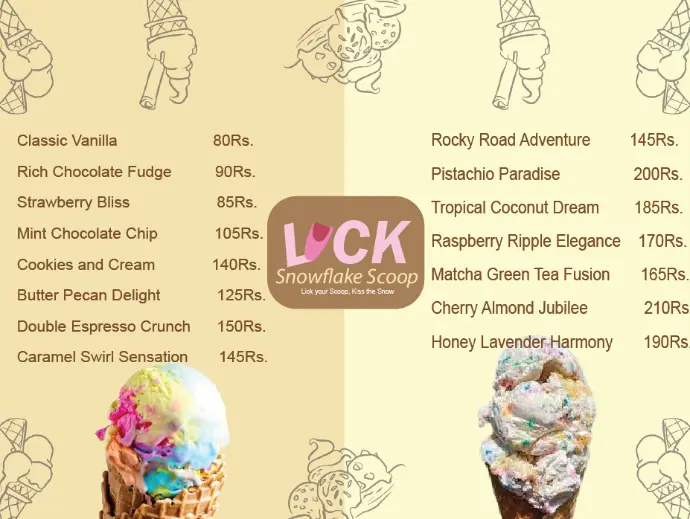
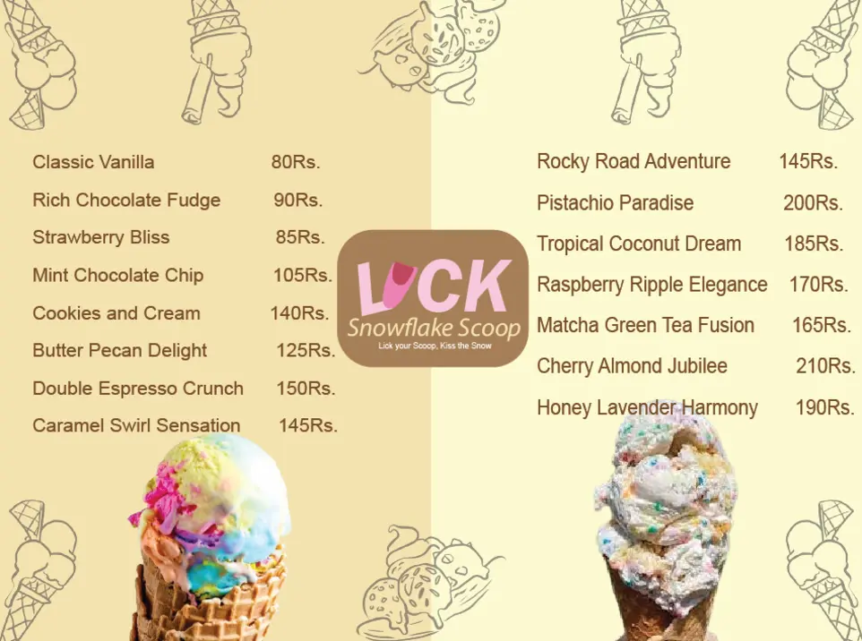
Menu & Product System
We crafted a menu architecture that is clear, appetizing, and functional, bridging aesthetics with usability

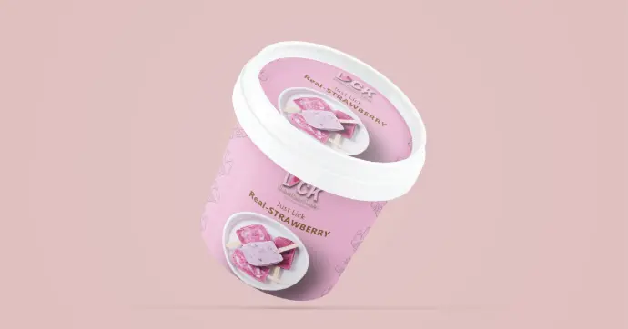
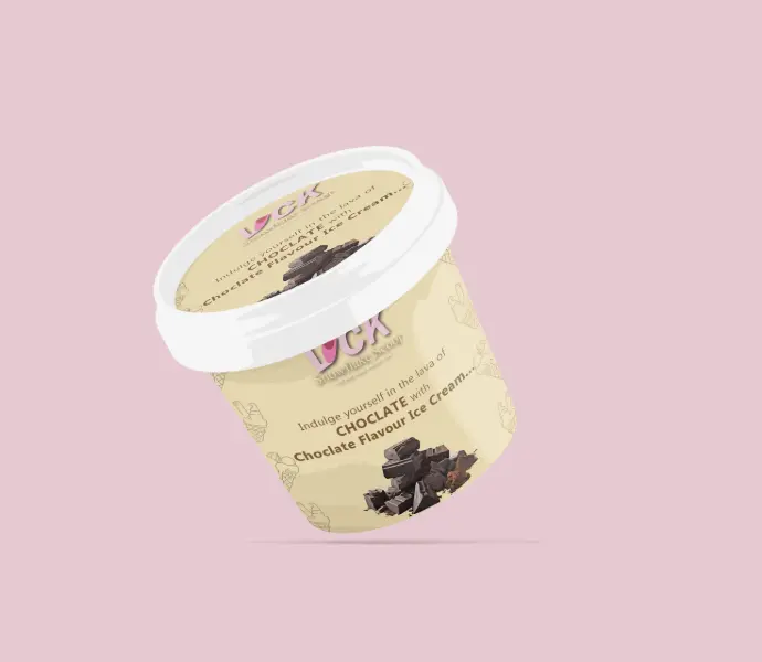
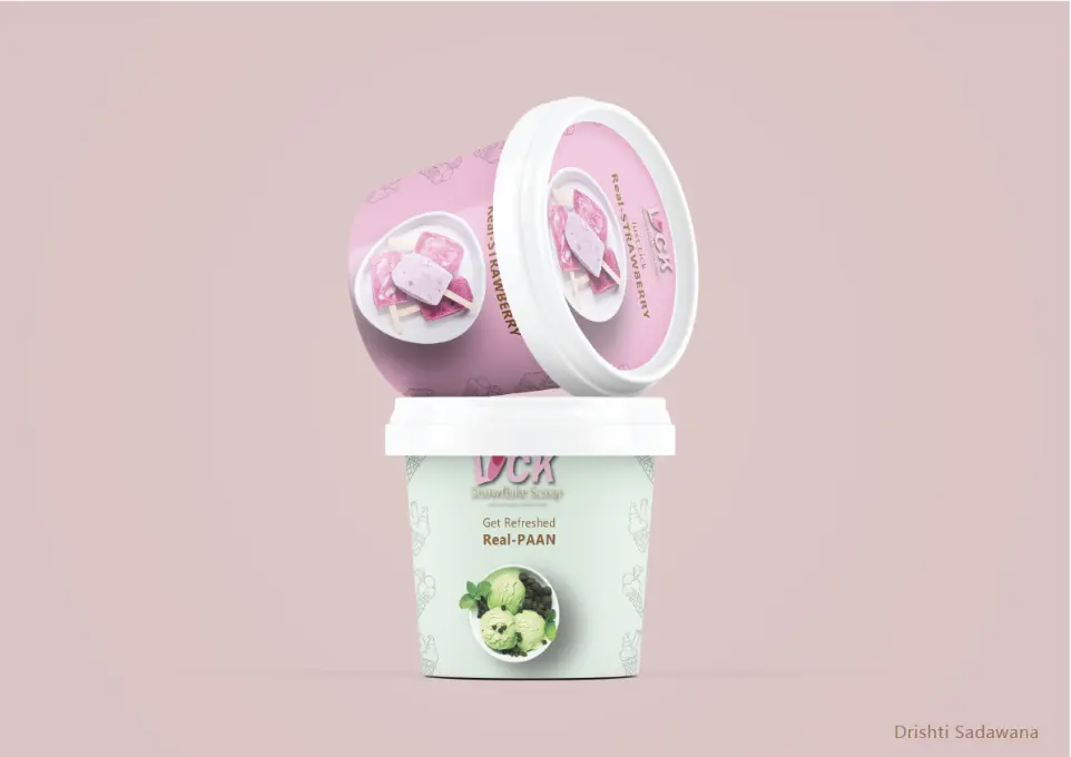
Packaging & Collateral
We extended the identity into packaging tubs and merch.
Packaging: pastel tubs with flavor photography.
Merch: T-shirts, visiting cards, social icons.
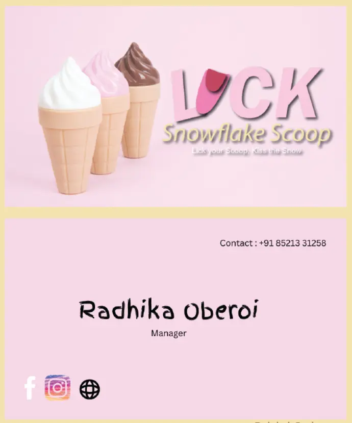
Visiting Card
Designed in Pastel colours with a highlight of social icons, name and position in the company with focus on logo and brand name.
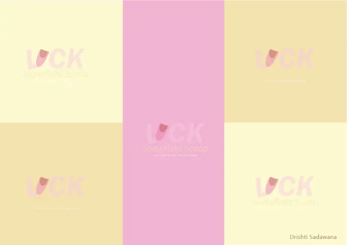
Visual Identity
Key Principles: Logo, Colors, Typography, Motifs
Final Outcome
- Strong visual recognition across print + social.
- Flexible design system, easy to scale for future campaigns.
- Emotional branding, resonates with target audience.